I’ve worked on several new features over the last two weeks, including an upgrade system and a shopping menu. Nevertheless, as I build test maps I continue to find ways to tweak pathfinding so that the monsters behave intelligently, smoothly and aggressively.
One issue is the weight given to creature positions on the map. I give walls and trenches a weight of 9999 to ensure they are never a preferable part of the path. I also poll the creature positions to give creatures some weight–without this, the monsters don’t bother to move around one another, and it’s just not scary.
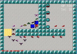
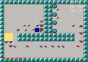
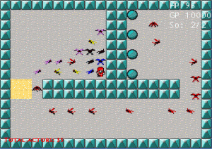
Fine-tuning of the weight added to squares occupied by creatures has paid off. Below are three examples of too little, too much, and just right. All three screens were taken at the same point after game start, and you can see how many more monsters can reach the player with the proper weight bias.

Monsters are shaded different colors to show their current movement mode:
- Red: Full pathfinding (cannot see target)
- Yellow: Uncrowding (cannot reach target and only has one direction to move)
- Violet: Has line-of-sight to target and moves toward it Gauntlet-style
- Blue: Adjacent to target (attacks repeatedly)
- Black: Crowded, no movement options (stunned briefly)

