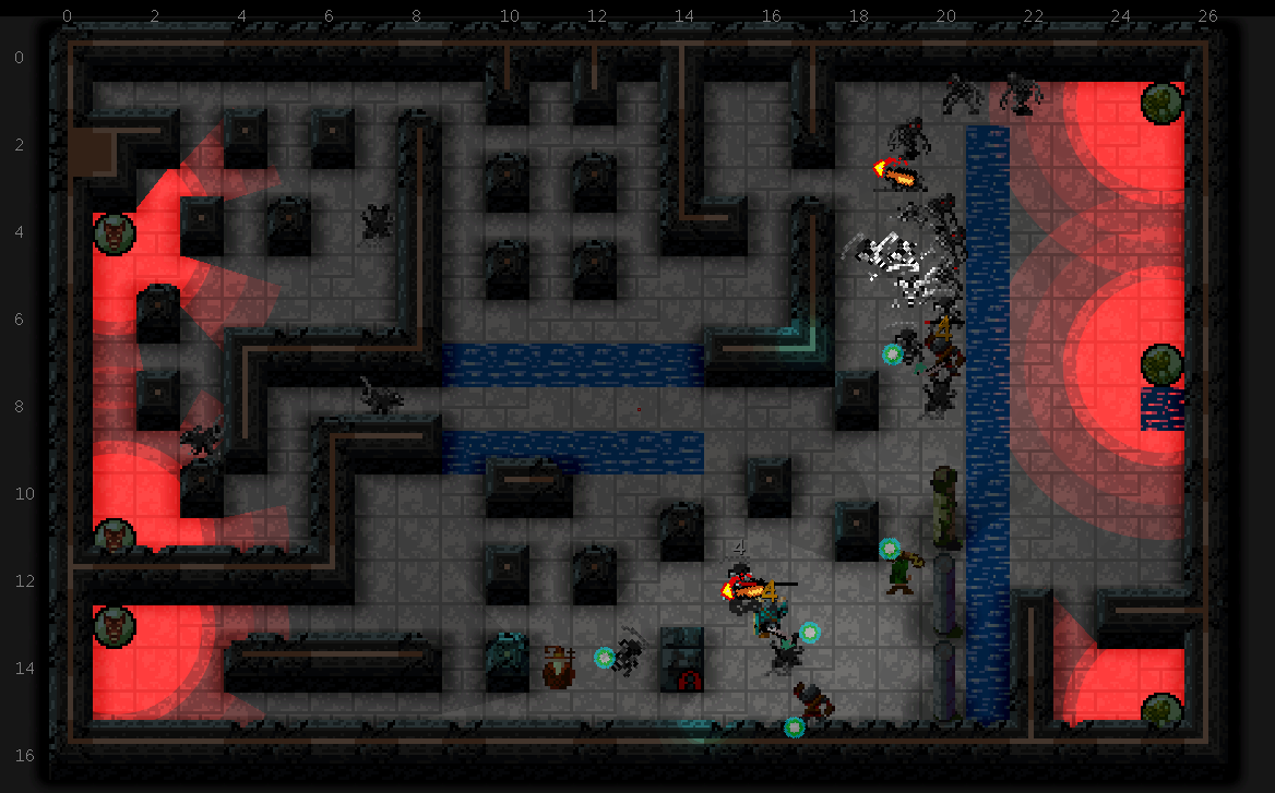
Most of today was spent doing fixes for the editor to handle the updated room definition and pattern format. But that doesn’t make for an interesting screenshot (yet), so here’s a test level with some light sources:
 It’s starting to look a bit cooler. Need a few more light sources and better shadow behavior.