The Playtesting Party – Some Quick Tips

Tomorrow is another Escape Goat Alpha Playtest Party!   That means tonight is a blog post on playtesting, lightweight, indie-style. In other words: you’ve got friends, some of them play lots of games and others don’t, and you want both types to try out your game and give you their valuable feedback.

Throwing a party is a great way to get this free labor from your friends and family without feeling too guilty about it. Just provide them with enough food and drinks to ease your conscience. And it’s not such bad work either, playtesting games.

Now I’m not the master of testing, and a lot of these tips probably come straight from Jesse Schell’s The Art of Game Design. For Soulcaster I, II, and Escape Goat I’ve probably hosted about ten proper playtesting parties, and here’s what I’ve picked up from them.

First question: When to start playtesting? There’s a point during development where you think things have come together enough that you have what could, in some stretch of the imagination, be described as a “game.” Maybe it doesn’t have a beginning/middle/end, maybe the graphics are placeholder and there’s no audio yet, but there’s something there and you can put it in someone’s hands to be judged.  This thing that has until now been called a prototype has now somehow become a game.  If you’re there, let’s get started.

1. Test it yourself beforehand. If you’re making tons of last minute changes like I do on the day of the party, just be sure you’ve given it one full run-through to make sure you didn’t accidentally delete the switch that opens the door to level 3.

2. Have a cohost. A significant other or close friend will be needed to greet guests, cook food, send out for more beer, talk to the cops, etc. You’ll be way too engrossed in the testing to be a proper host, so don’t even try.

3. Fresh meat first. Anyone who hasn’t seen the game yet gets first dibs, lest they catch a glimpse of someone else’s session and have their first impression become corrupted. If someone else is testing while a newbie arrives, have your cohost distract him or her for a bit. “Have you seen the new patch changes in HON?” for example.

4. Tell your tester to speak their mind while playing.   Anything that’s running through their head. Here are some direct quotes from the last playtest:

  • “Wait, did that do anything?” (after skull activation)
  • “That’s the same message that I read earlier.” (story tablet at region 1 entrance)
  • “Did that guy just hit something?” (reaper in level 3 third room)
  • “I like that he looks really, really scared” (idle edge sprite for goat)
  • “Why do the blocks have color on them?”

This way, when a player is wandering back and forth in the opening area, you can get an idea of why. Can they not find the exit, or do they just like the walk animation? Personally I hope it’s the latter, because the two-frame goat run visual took me freaking forever.

5. Remain silent. No hints or explanations of how things work.  You’re a fly on the wall. (The exception would be a known glitch that hides information and could cost time, for example a tutorial notification that isn’t showing up in this version for some reason, but will be in the final version.)

6. Take notes.


About four testers in one evening generated this many written notes.

7. Have a roundtable discussion afterwards. If you’re making games, odds are you have friends who have strong opinions on games. This is one of my favorite parts of the testing party. I’m surprised to hear what people liked and didn’t like, what they would like to see in the next version.

8. Process your notes and thoughts the next day.  I personally love using BlueMind for this, but maybe that’s because I’m a recovering organization software junkie.  The point is to get a nice list of bugs to be fixed, major remaining design issues, principles on designing levels going forward, etc.

This is a branch of the mindmap I made based on last week's playtest.

So that’s it, hope this has been somewhat helpful, and if you’ve got additional tips, please post them in the comments!

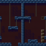
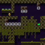
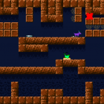
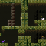
New Escape Goat Visuals

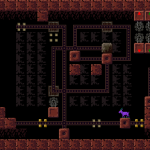
While none of these tilesets is final, they should give a pretty decent idea of what the game will look like.  The jungle level is kind of experimental, and I’m not sure if organic levels really work well with the minimalist/blocky look of the game.

Today was an awesome day for getting stuff done–probably fixed 20 bugs and added several long-needed features.


In-game Level Editor Update

Today I worked exclusively on the in-game editor for Escape Goat.  There is no external editor–no Windows program or special version of the game I use to make levels.  Everything I use to create the built-in game will be included with the product!

My goal is to give first-time game designers a toolset for making something.  This means making things more user-friendly than I normally would.  Usually I just build my editors for stability and speed, but this one’s got to be pretty (enough) and totally straightforward.

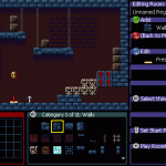
 The editor as it existed this morning looked like this:

This version of the editor has been working great so far.  I have single button presses for every action, so there’s no need to use a menu for anything.  This lets me crank out levels and prototype them rapidly.  Though it may be really fast for me to use, I built it and have spent plenty of time with it.  I can’t expect someone new to jump into this and understand it.

Just looking at this screenshot, we have several immediate problems:

  1. There’s text bleeding off the edge in the properties editor, because it’s using the large, in-game font.   Speaking of this font, it’s not going to be very good at conveying button names.  Can you tell that’s [RT] at the bottom?
  2. There’s a lot of wasted space at the bottom with the Thing Selector (the big orange box).
  3. There’s no way to know what each window is at a glance.
  4. The windows are out of alignment, and the Thing Selector doesn’t even have a proper border.
  5. Placeholder text for header and footer needs to be replaced with something useful.
To come up with an improved layout, I started with a screenshot and loaded it into GraphicsGale.  Its built-in grid and alignment made it easy to move and resize the windows along the 8×8 pixel grid.  Not only that, but I could pick a good font size and get exact screen coordinates for all my editor windows.
Did I mention GraphicsGale is the most awesome spriting program ever?  Well it’s also good for mocking up screen layouts.
(Several hours later…)
Here’s how the editor looks now:
Besides being easier on the eyes, it has many usability improvements:
  1. Smaller font can show more text without bleeding off the edge.
  2. Windows can have colored strips at the top for header text, which can be a simple label (Region Map) or a dynamic label, like the Thing Selector which shows the category name.
  3. Graphical icons for Xbox controller buttons.  This makes such a huge difference.
  4. Map dimensions changed from 11×4 to 9×5. Almost the same size in room count, and it fits better in the editor.
  5. Thing Selector shows 3 rows of 8 things at once, which is less overwhelming, and takes up less space.
  6. The “cheat sheet” on the right  is all dynamic depending on where you are in the editor, from the Map Editor to the Room Editor to editing a single gadget within the room.  Each strip shows a button, command name, data field, and graphical icon.
The behavior is almost the same, but it’s much cleaner and smoother now.  I still have to add some more icons for the cheat sheet, but that should be about it.  I’ll post a video soon demonstrating its use, and I hope everyone will find it approachable regardless of their experience designing games!

Soulcaster II Press – Long overdue roundup

It’s been forever since I’ve compiled the reviews, interviews, and mentions from around the interwebs relating to Soulcaster II.  Let’s get this party started!

Fire up Google Translate for Interview – Ian Stocker, créateur de Soulcaster II from French-language games website GameSideStory.  Also from this fantastic website is a very comprehensive review.

Steven Hurdle at Writings of Mass Deduction checked out my game for day 173 of his 1-XBLIG-per-day stetch.  Bottom line? “Easy to recommend.”  Thanks Steven!

Over at XBLAFans we’ve got James Heiger’s review where the game has made a very positive impression for its music, nostalgia factor, and unique game play.  He makes a valid request for a scoring and ranking system, something I will be looking into for SCIII.

Check out the in-depth coverage I got at Game Interface.  Derek Strickland explains the game mechanics and features in detail, and the game gets a 9/10.  Groovy.

Nick Marroni posts Underground Kings: The 25 Best Xbox Live Indie Games and Soulcaster (the original this time, not the sequel) gets the #8 spot!

Brainlazy features an article by Decoychunk on the Winter Uprising titles, and gives Soulcaster II a respectable 8/10.

Jonathan Lester features Soulcaster II (along with RadianGames Crossfire and Ska Studios ZP2KX) in its Indie Game of the Week segment.   High praise: “There’s nothing quite like it … Highly recommended.”

 GameDebateClub offers coverage and they seem to like it pretty well–though not huge fans of the visuals, the found the gameplay enough to overcome that and were compelled to play the whole 2.5 hours.

Do you like top lists?  We like top lists…

SFX-360 places the 2-part series at the #2 slot (behind Robert Boyd’s excellent Breath of Death VII) for Top 10 Xbox Live Indie Games of 2010.

Matt Miller lists us as one of the Five Xbox Live Indie Games for the New Year.

And we land in the #8 slot on XBLIGR’s Top 20 Best Xbox Live Indie Games of 2010.