Last Saturday was the Escape Goat Alpha 4 playtest, and the next big design challenge has shown itself and thrown down the gauntlet. It’s a hard problem to define, so I’m hoping that writing this will clear it up in my head. It might also make an interesting story for anyone who wants to see the gruesome behind-the-scenes of game design.
Escape Goat is a puzzle game at heart. You’re there in a room, pitted against obstacles and mechanisms, trying to reach the goal. My playtest version of the game had several stages of training, where the player learns the game mechanics, controls, and how the various gadgets operate, before being plunged into a puzzle that takes some problem-solving skills to beat. The first few puzzles would basically solve themselves in a fun and visual exciting way while teaching you how the game works. These rooms were fun to build–basically single-button Rube Goldberg machines that make you go WHOA, COOL and that’s about it. Then come the puzzle rooms.
By their nature, puzzles can enter an unsolvable state if you mess up. There are blocks that drop and can’t be lifted again, crates that break, switches that stay permanently thrown. If you do things in the wrong order, you’re cooked and have to retry the room.
The problem is, the game doesn’t know when it’s in that state. Play testers were poking around in a room for a few minutes trying to solve the puzzle even though it was no longer possible. This just can’t happen in the release version of the game–the lack of feedback is frustrating and boring. The player has to get the memo that the room is now unsolvable, and a retry is required. Detecting and delivering this message is the big challenge I’m facing.

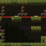
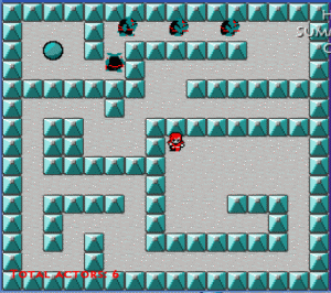
Let’s look at one room in particular. This room is the first one where you can actually “lose.” There aren’t many interactive elements, just the three buttons on the top level. The green one operates the push block on the left, the blue one lifts the platforms in the middle level, and the red one releases the top (red) platforms. The proper solution is to hit the buttons from left to right, which transforms the level like this:


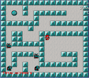
The blue platforms lift to catch the blocks, allowing access to the yellow button on the bottom right, which opens up the passage to the left. If you hit the red button first, here’s what happens:

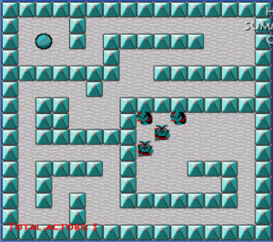
The blocks have fallen and are blocking access to the yellow button on the bottom right. You’re screwed. You have to restart the level from the pause menu or by leaving the room and re-entering. But… how can a new player know the puzzle is unsolvable now? There’s no message. You’re just left wondering what to do next.
I’ve thought of a few solutions:
- Design the puzzles so they can’t enter an unsolvable state. Well, this would make for a pretty easy game.
- Design the puzzles so that something kills the player when they enter an unsolvable state. This is a better solution than what we have now, but it means inserting a lot of violent gadgets (lightning machines, buzz saws) and having to account for all locations the player could be on the screen.
- The game checks to see if it is unsolvable and delivers a message if so. Checking programmatically is something that would add months to the project, if not years, so that’s out of the question. But maybe the room could have a bit of hidden data built in to detect for states that would make the room unsolvable. For example, I could have a hidden block detector checking the area in front of the switch to see if the blocks have fallen there.
- Kill the player instantly, which would be really jarring. No good.
- Bring up an on-screen text sprite, which is more subtle, but not very thematically interesting.
- Have a gadget that activates in the unsolvable state and allows quick restarting of the level, a cool thematic solution but maybe a bit too abstract compared with the on-screen text.
