Lighting

Though Soulcaster 3 has been using the Escape Goat 2 rendering code for a while, today was the first day for me to enable the lighting features. It uses pretty much the same techniques as before, though we’ll need to account for the different surface facing directions given this new camera angle. With EG2, it was easy because you could only ever see one face of a cube, from the side. In SC3, with its early Final Fantasy camera perspective, you can always see the top and one side of a cube. We’ll figure out a solution to lighting objects at some point (maybe with some tasteful normal maps). In the meantime it actually looks pretty cool:
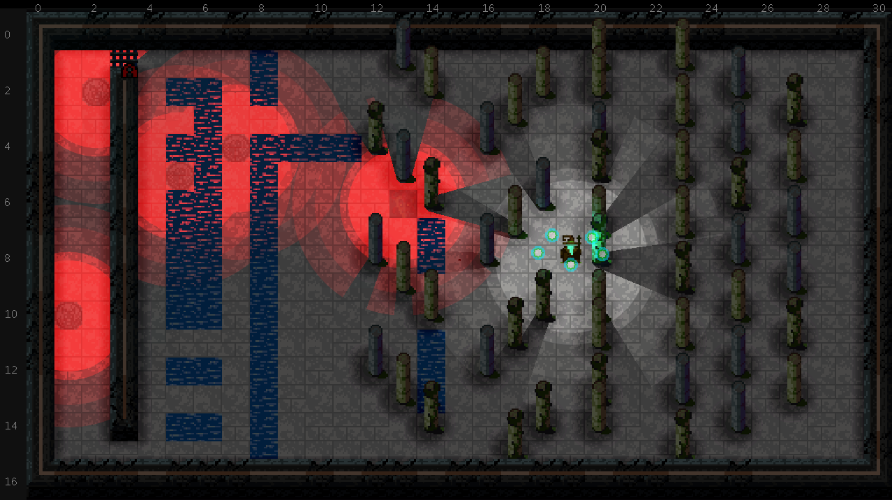
lighting1Everything is set pretty extreme to start. The light cast by the summoner will likely not cause shadowing on the floor, because as cool as this looks in motion, it actually makes me kind of motion sick to have it constantly casting rays around. And Randy would kill me if I tried using red #F00 as a light hue.

The fake ambient occlusion is back as well, which involves stamping a blurred rectangle or circle subtractively to the light map at obstacle positions. This will be cleaned up to be a lot more subtle for stuff like the pillars.
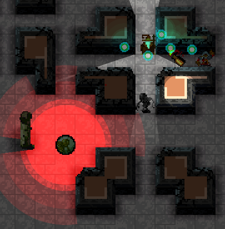
lighting2Because we composite the scene with two basic layers, each with its own lightmap, we can have elevated objects cast light on the walls below them. Here we have the molotov cocktail casting some light down on the wall, but the light coming from the summoner doesn’t affect the tops of the walls. This goes a long way to making the scene look 3D.
More Tile Blending

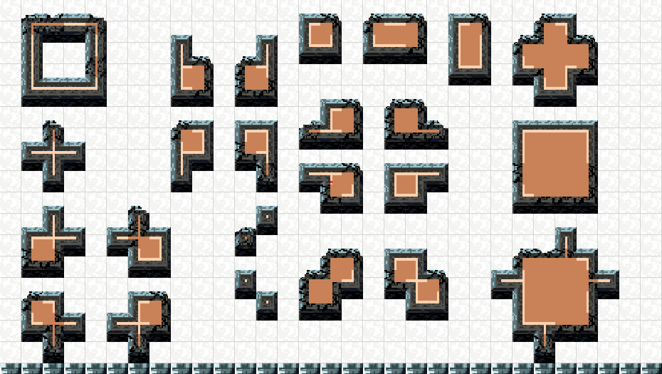
The tile blending now supports diagonal neighbor detection. It’s not nearly as simple as the cardinal direction testing, because it’s geometrically more checks if you do them all. I decided to just use a table of specific variants, and the game tries to match them as best it can given the neighbor tiles.

eightwayblending

Decay

The tileset handling is getting a lot more robust. I’m working on support for multiple tilesets, and tiles shared across sets. That should be ready pretty soon. In the meantime, here’s a randomized alt tiling system to show decayed versions of the walls. Instead of being randomized, it could be based on Perlin noise or some broader pattern, and even have multiple levels of entropy.

decay

Debug Visualizations & Tile Blending

With each project, I put a bit more time into debugging visualizations. I just try to look for things I spend time debugging a lot (where I step through code) and making sure there’s a quick way to show how things are working.

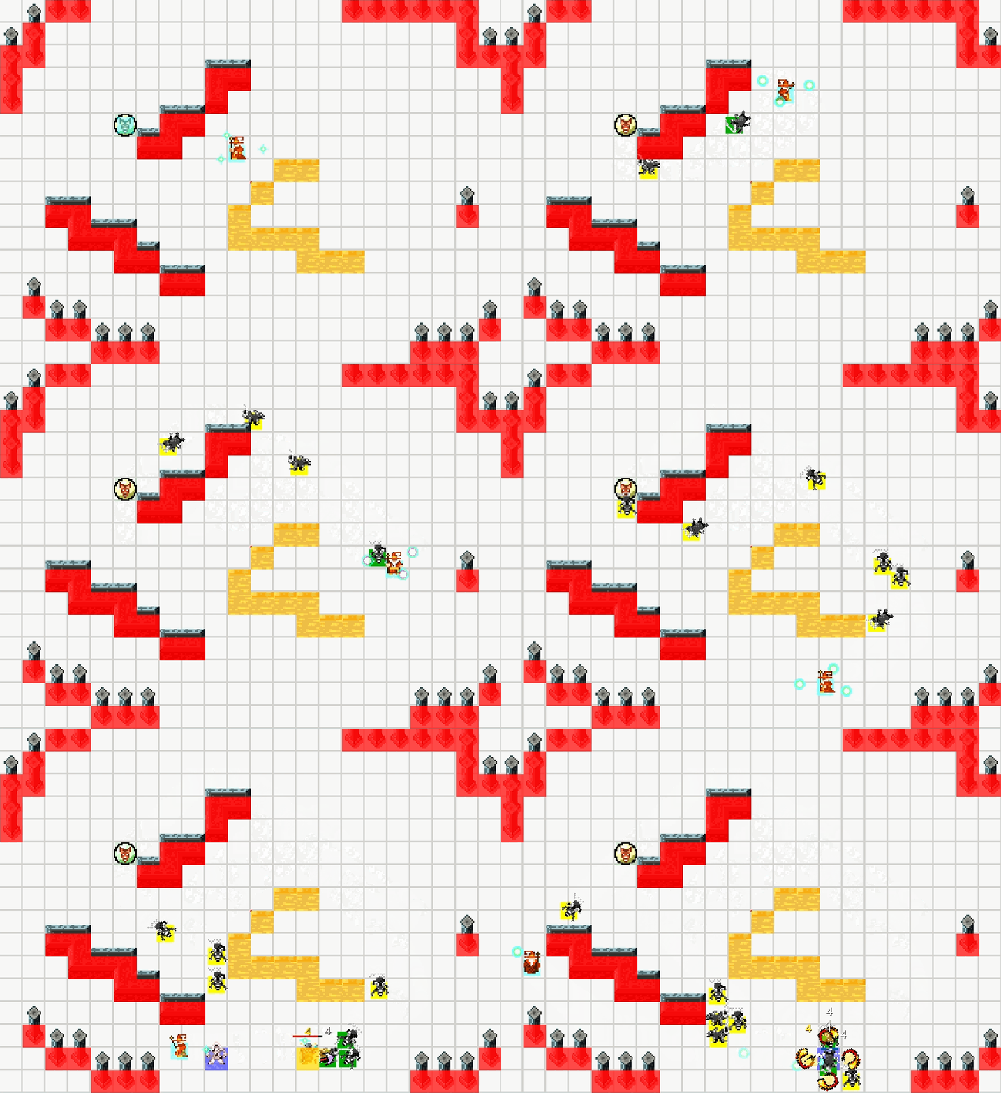
The most basic is the hitbox visualization, which shows world geometry (walls are red, trenches are yellow) as well as actor hitboxes. The monster hitboxes change color when their AI switches from pathfinding to Gauntlet movement (when they are in line of sight).

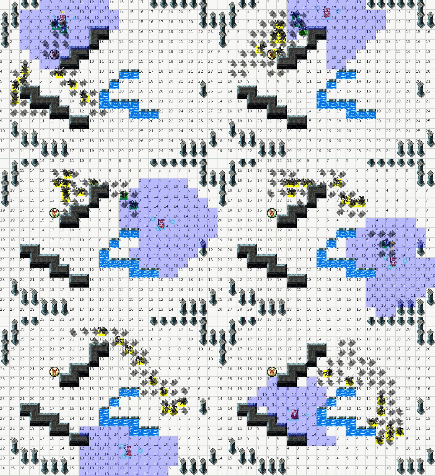
This is where you can see a few different layers of the pathfinding AI. The blue blob following the summoner is the vision radius. When monsters step on it, they switch from using pathfinding to directly walking towards the player. The numbers in the top right of each tile are the step values for the path map. They actually represent how many tiles away the target is, in this case the summoner. The numbers in the bottom right of the blue blob are the priority levels for the vision. Because summons also broadcast pathing and vision fields, each tile needs to have a specific target based on distance.

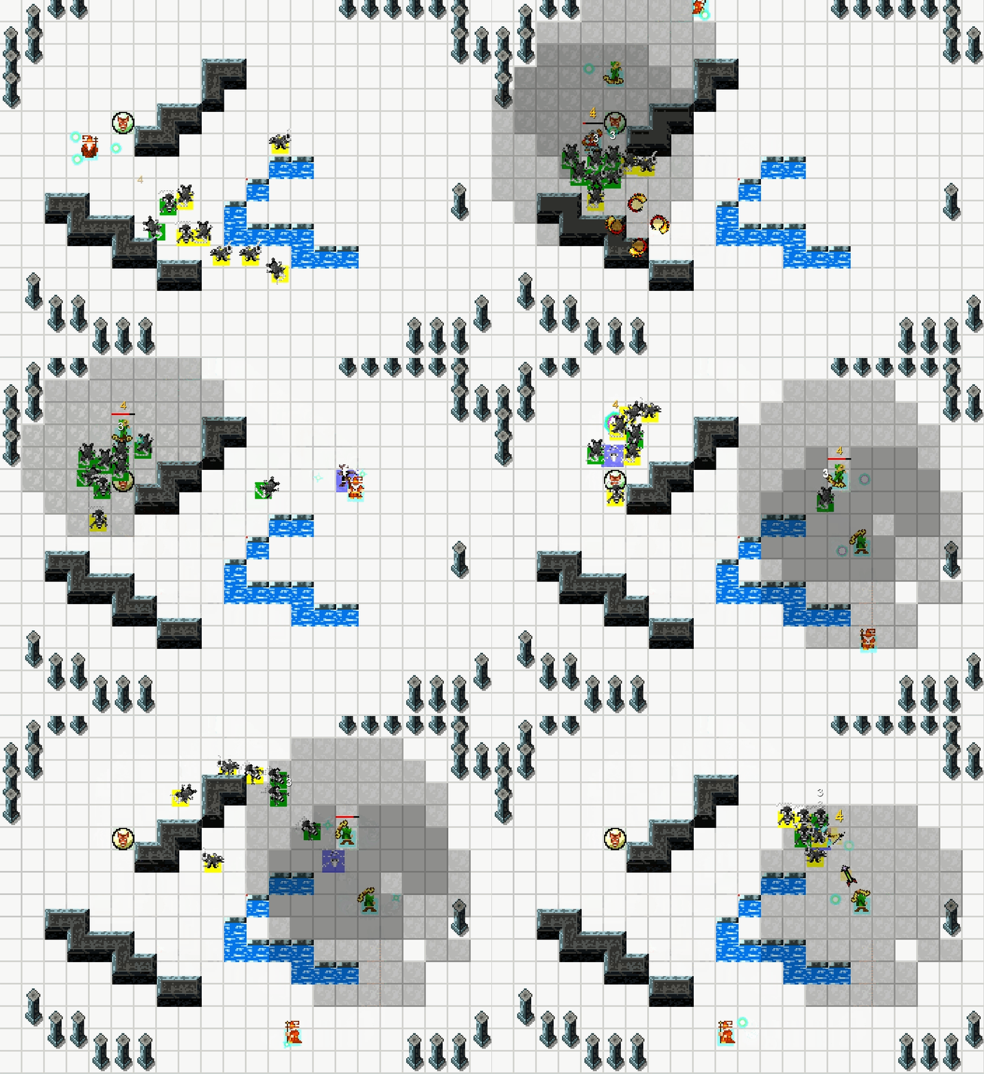
Finally we have the targeting radius. This is built just like the radius above, but it’s not obstructed by trenches. It’s used for the archer to pick targets. In the previous Soulcaster games, NPCs would fire off “line of sight” tracers to find targets. Because of how expensive these were for the CPU, they would have to be restricted to intervals of once or twice per second. This just made the AI slightly less responsive. This system is instantly responsive and by my guess, uses about 10% of the CPU power.

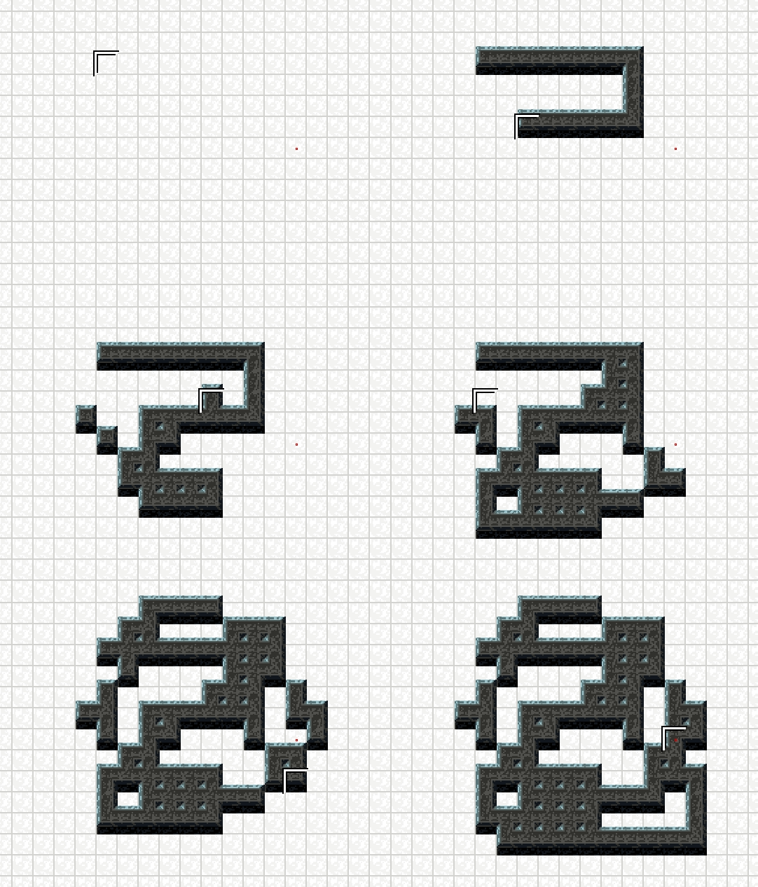
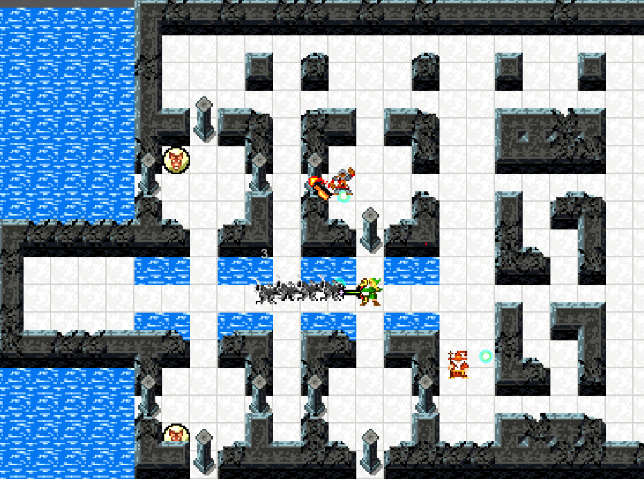
Not a debugging feature, but it’s something I just finished today and think is pretty cool. Since the levels are generated from basic elements, I have to teach the computer to do all the nice tile blending I did by hand in the previous games. It’s a fun challenge. This test just shows 16 different blend tiles which use the cardinal directions. To get rid of the divots in the corners of solid walls, I’ll need to add support for all 8 adjacent tiles. This can be used all over the place, for both natural and artificial architecture.