The game is approved! It should be on the marketplace within 48 hours.
Tag: Development
Spriting from Concepts
I have commissioned the incomparable Bruce Glidewell to do some creature concepts for me. I am decent at sprite art, but never was great at detailed characters, especially humanoids. It’s great to have a pro handle this. In fact, this is the only aspect of the game I’ve outsourced yet, and the lion’s share of the game’s budget. I foresee buying a bunch of friends pizza for a beta testing party, and then there’s the fee to join the XNA Creators Club to test on XBOX, but really, that’s about it.
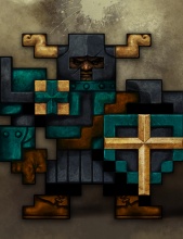
Given the limited budget, I asked only for monochrome sketches of the four heroes and four of the monsters. Bruce went way beyond the call of duty to create an awesome set of hero sprites. Here’s the knight (tank summon):
And here he is reduced to the game’s 16×16 tile constraint:
Current progress: I’ve done all the spriting and animation for the main character, three summons, and two of the four monster types. Very soon, the placeholder art will be gone and the game will have a look all its own. It’s gonna be bad ass.
Tarchon is now SOULCASTER
Tarchon is a good working title, but I knew it was never going to cut it as a release title. The main reason is the ambiguity. As a 10-year-old in an arcade, on my last quarter of the day, there are two machines I haven’t tried: TARCHON and DUNGEON DESTRUCTION SPIRIT MASTERS. With DDSM, I know what I am getting. It’s reliable. Very likely there will be wizards and swords. Then there is TARCHON… what is this one? Is it sci-fi? Is it going to be one of those puzzle games where it takes four quarters just to understand the rules? The other game promises instant action. I’ll go with that.
A four word title would have been too much, especially when I make the sequel (DUNGEON DESTRUCTION SPIRIT MASTERS II: SWORD ALLIANCE OF THE ANCIENTS). I struggled with 2-word titles for a while. After calling a council of a couple close friends, we landed on Soulcaster. James gets credit for this one, plus a McDonald’s gift certificate. See how handsomely I reward my consultants?
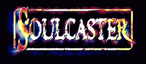
Anyway, I spent some time in Paint.NET earlier this week and came up with a logo. It seems to be a bit too jagged and horror-looking, but it’s in the right direction and the final game will probably have something like this.
New Mechanics: Dialog box, merchant, upgrades, drop items
The best way to show the latest changes is through a video. The graphics are still placeholder but you can get an idea of what it will look like. My next step is to make it possible to move from floor to floor. Once that is in, it should feel like a real adventure rather than just a tech demo.
The aesthetics like text and menu animation are details that could have been ignored until later in the project, but it helps keep motivation up to see cool visual effects. When it’s just a slog of behind-the-scenes changes, it is easy to lose track of the excitement of the game. The visuals are also not nearly as complex as the tough stuff like AI and collision, so I can get some easy wins on those days when I just don’t feel like working.
It’s really coming together.

