The Detours of Prototyping

You know, it’s really time for an update on Soulcaster. The longer it gets in between these things, the more I feel like I have to write a long treatise on everything that’s been going on since the last update. And yes–lots of stuff has been happening! But I can’t get to it all in one post. For now, I’ll just try to shed some light on where the project is, and what it’s gone through in the past few months.

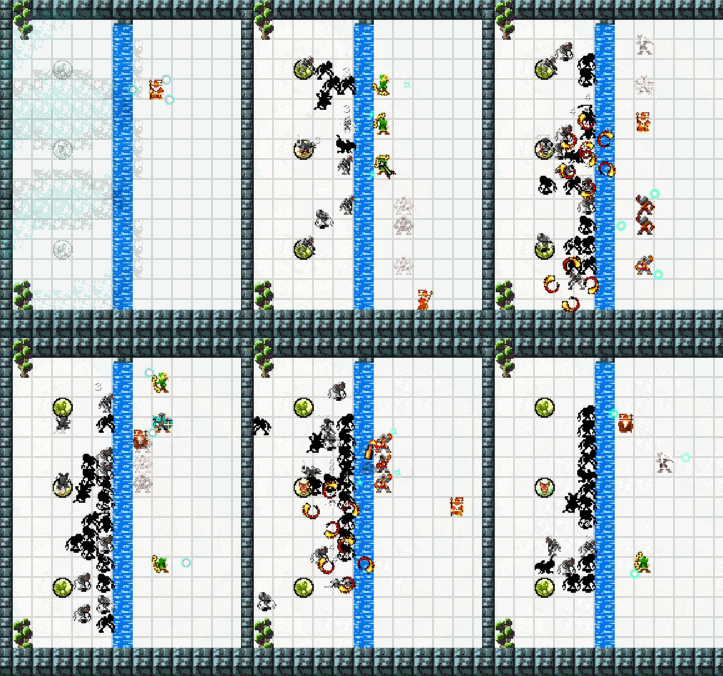
My concept for Prototype #2 was to focus on the micro game of combat, and leave the exploration, upgrades, and other metagame stuff for later. So I set out to make a single-screen “waves of enemies” scenario, which gradually added more monsters to the scene after each level. I got it functional enough to show a few people, and quite honestly, nobody found it that interesting.

The reason is that I am missing a key component of what made the first Soulcasters fun and different: combining summon-based combat with exploration and dungeon crawling. The exploration element–moving from room to room, dealing with traps and ambushes as they come up–is just way more engaging than sitting in the same room, waiting for enemies to emerge from predictable places, over and over. It devolved into kind of a lame quasi-tower-defense experience.

It was also a bit too… institutionalized. Soulcaster should be about quick decision making amidst chaos–not, “Okay, are you ready for the next wave?? HEEERE they come!” which is what my prototype became.

Side note: Secret of Mana is one of my all time favorite games. I remember back in the day when I could finally play the only-available-in-Japan sequel, which had been fan translated for the emulator (shhh, don’t tell Square). Now, there’s no question that the graphics in Seiken Densetsu 3 obliterate those of its predecessor. But the gameplay just felt sterile. Each battle had a start and end, kind of like a turn-based RPG, and it defeated the purpose of action-adventure. I missed being given the option to run past enemies.

Without realizing it, I had kinda done the same thing to my game.

But that’s what prototyping is for: to try new things, see what works, and keep the good stuff.  Even though the experimental new scenario didn’t work, there’s actually a lot of good stuff to keep:

  • A “windwalk” (phase boots?) ability for the summoner to escape when he gets pinned down. It lets you walk through enemies and become invisible to them. It’s also useful to slip into a new part of the room to begin setting up a “fallback” position
  • A mana meter that charges up as you slay enemies. I’m going for a Devil Trigger/Rage of the Gods type of mechanic with this one. There are a lot of potential uses, like powering up an existing summon, doing some sort of ultimate summon form
  • Procedural generation of monster populations. I can have the room use a “budget” for monsters and pick a theme for them, and it divides them into waves and places them appropriately
  • When you destroy a monster spawner, it tosses shards of debris into the air, which spin and bounce when they hits the ground (this is important)
  • Housekeeping code revolving around keeping an inventory between rooms, starting a new game, gaining new powerups, etc. It’s not exciting to read about, and even worse to code, but it’s just one of those things that makes it feel like “a game”

So for Prototype #3, I really am aiming for a sparse, functional version of how I envision the full game: interconnected rooms, wandering monsters, traps and ambushes, obtaining items, deciding when to retreat or avoid an encounter. There are lots of unanswered questions about item and character progression, and I think it’s best to address those once the nuts and bolts are all there. Start at the ground level and work our way up.
 

Procedural Room Generation Explained

There are lots of ways to do procedural dungeon generation. I came up with a way that will allow for both really chaotic room designs and fully formed, hand crafted rooms. It’s based on joining smaller patterns together to form the room’s interior. In this post, I’ll do my best to explain what’s going on.

Setup: Defining Patterns

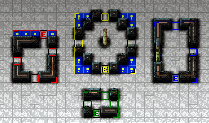
This is a collection of four small primitive patterns, bound in separate colored boxes.

I use the editor to make this room, which contains four basic structures, the patterns. Everything is composed of simple tiles like walls, columns, floor, and water.  Metadata in the room file marks specific tiles to define the pattern area (colored box enclosing the pattern) and two special types of tiles: the inlink and outlink positions. Each pattern has one inlink, shown with an E (for entrance), and one or more outlinks (empty colored squares). These are used to join patterns logically, which I’ll explain later.

For now, let’s walk through each step of the layout algorithm.

1. Create an Empty, Enclosed Room

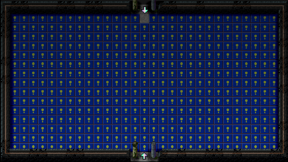
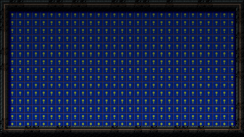
The blue tiles are empty spaces--I know, it reminds me of Super Mario World too.
The blue tiles are empty spaces–I know, it reminds me of Super Mario World too.

Rooms can be any size–I’m using 31×17 as the default size for now. Each room is enclosed by the basic wall tile. (Walls are automatically blended to their neighbors in a separate algorithm.)

2. Place doorways at the door positions.

The top doorway has a cute little doorstep marker to prevent anything from blocking it off during construction.

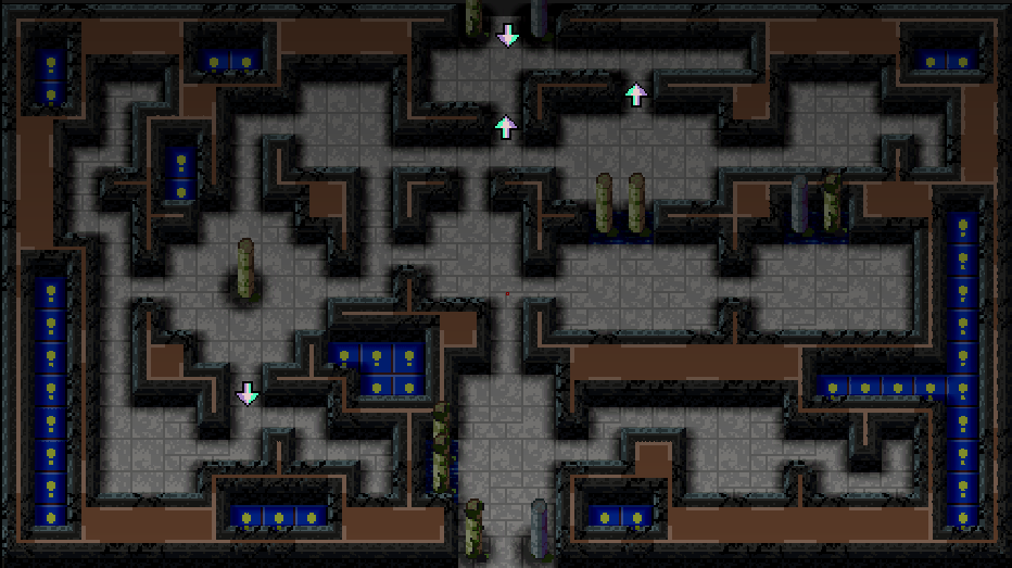
Each room has one entrance, and optionally has exits on the three other walls. In this room, we have the entrance at the bottom center, and a single exit at the top center. Some decorative side pillars are added for some ambience.

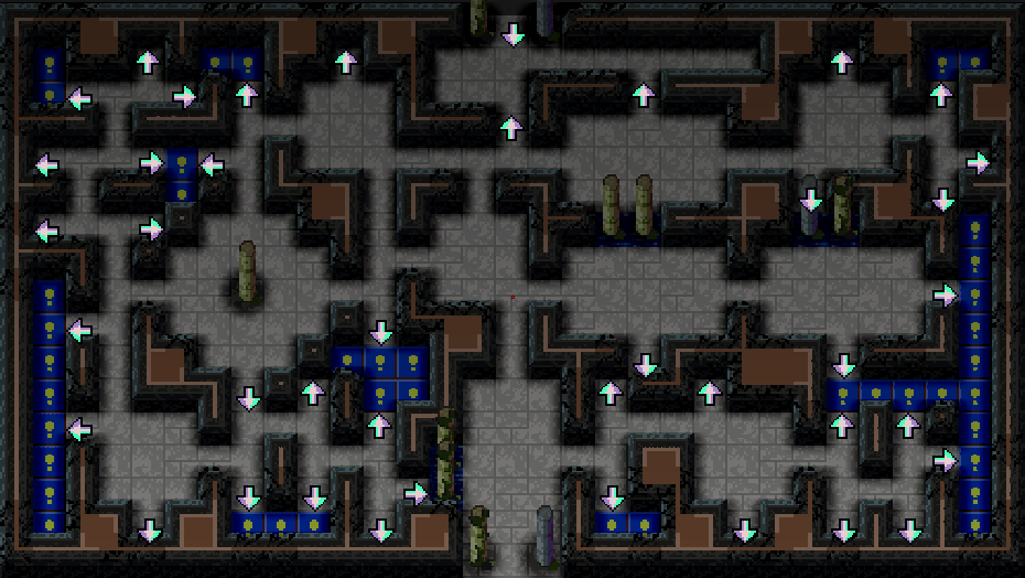
The arrows are special. An arrow on a tile means that tile is a boundary tile and can be joined to other patterns. The engine knows to start at the bottom arrow, because that’s the entrance door, and that’s where layout begins. The bottom arrow is actually treated as a pattern outlink (explained next).

3. Find a Pattern from the Collection

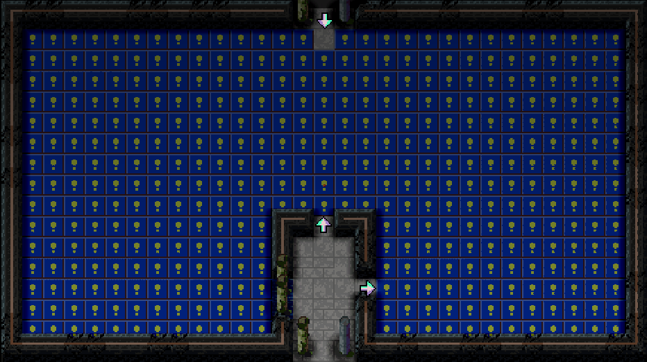
A pool of pattern candidates is created from the four patterns we defined in the editor earlier. It automatically makes variants that are flipped and rotated in various ways for the ultimate in variety and versatility.

To select a pattern, it goes through each one and tests it against the room’s outlink positions (currently just one, at the entrance door). It checks if the pattern will have all of its floor tiles contained within the room and not intersecting with existing walls or water. Once it has the list of candidates, it randomly selects one, and the layout engine applies it to the room.

It picked the blue pattern from our collection! Excellent choice.

After the pattern is applied, it clears the outlink marker that was used, so it doesn’t get tested in the next iteration. Instead, we have two exciting new outlinks, provided by the pattern: up and to the right.

4. Repeat step 3

…over and over, until nothing else fits.

5. Ensure a path to the exits

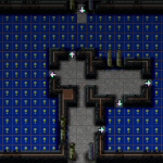
We only have one exit to worry about in this room, so it’s only done once. It essentially does a Photoshop-style “flood fill” of floor tiles starting at the exit’s doorstep position:

We can reach the exit now

This isn’t always necessary, because sometimes the layout engine conveniently places a pattern that enables passage to the exit. The engine will never place a wall blocking the exit, because of the “reserved” doorstep position we added at the beginning.

6. Trim Dead Ends

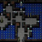
Anyone who’s played Soulcaster knows how deadly nooks and crannies can be. If you get chased in there, you’re going to have a hard time getting out. So in an act of charity, I turn the unused outlinks (the ones not pointing to floor tiles) into walls.

Much safer
Much safer

Notice it doesn’t get rid of all the dead ends, just the ones created by the dangling pattern links. If I wanted to be truly kind I could have it fully zap the dead ends and ensure circular passages everywhere. But that’s a task for another day.

7. The Finishing Touch

No more empties
No more empties

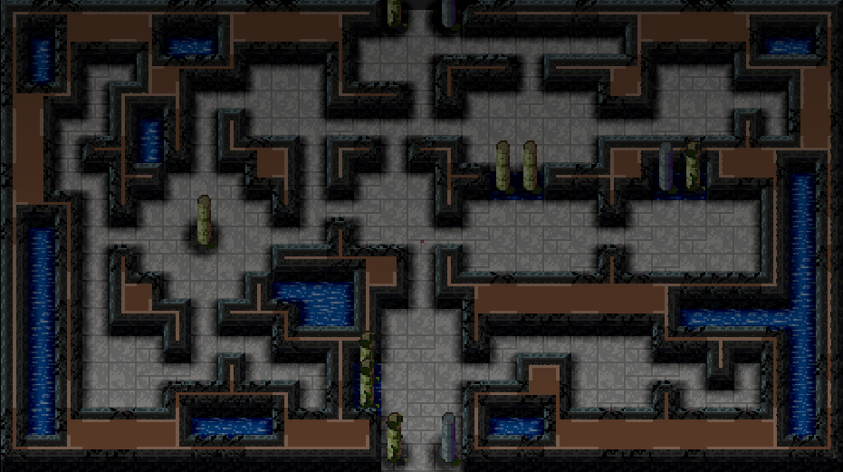
Leftover tiles are transformed into pretty water. Aesthetics.

So that’s basically it! I’m aware that while this type of chaotic level layout may be interesting, it’s not as cool as having a more pre-planned layout like the old school Soulcasters had. I liked to put concentric circles like walls and moats, have islands with bridges, or an enclosure surrounded by trees that you needed to infiltrate. That stuff’s all coming: the cool thing about this pattern system is that I can define patterns of any size, tag them for special purposes, and link them together however. A pattern could be an entire castle 40×40 tiles in size. It could even leave interior rooms vacant and link into them, populating them as needed.

Spawner placement is the next challenge, something I’ll be tackling this week.

Thanks for reading–and comment if you liked this post and want more of this sort of thing (or if you want to hear about something in particular).

Lighting

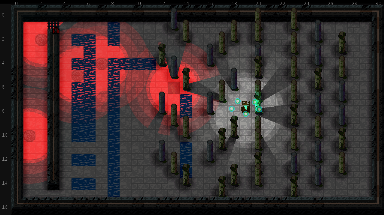
Though Soulcaster 3 has been using the Escape Goat 2 rendering code for a while, today was the first day for me to enable the lighting features. It uses pretty much the same techniques as before, though we’ll need to account for the different surface facing directions given this new camera angle. With EG2, it was easy because you could only ever see one face of a cube, from the side. In SC3, with its early Final Fantasy camera perspective, you can always see the top and one side of a cube. We’ll figure out a solution to lighting objects at some point (maybe with some tasteful normal maps). In the meantime it actually looks pretty cool:

lighting1Everything is set pretty extreme to start. The light cast by the summoner will likely not cause shadowing on the floor, because as cool as this looks in motion, it actually makes me kind of motion sick to have it constantly casting rays around. And Randy would kill me if I tried using red #F00 as a light hue.

The fake ambient occlusion is back as well, which involves stamping a blurred rectangle or circle subtractively to the light map at obstacle positions. This will be cleaned up to be a lot more subtle for stuff like the pillars.

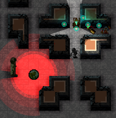
lighting2Because we composite the scene with two basic layers, each with its own lightmap, we can have elevated objects cast light on the walls below them. Here we have the molotov cocktail casting some light down on the wall, but the light coming from the summoner doesn’t affect the tops of the walls. This goes a long way to making the scene look 3D.
Excitement

I’m constantly coming up with ideas for whatever game I’m working on. I never have time to try them all, so I tend to bank the riskier ones for use in a sequel. But we’re still in the prototype stage in Soulcaster 3, so it’s the perfect opportunity to test a new combat idea I had last week. Once I saw this in action, I felt an excitement I haven’t felt yet in this project.

Sorry for the tiny file, WordPress is acting up and not allowing files larger than 3MB.

OG Soulcaster players will immediately see what the difference is here. Instead of recalling summons one at a time and placing them only when you have an orb available, you can now queue up “future summons” with markers. As the existing summons are recalled or destroyed, the orbs powering them will look for a marker to inhabit and spawn a new summon. If there aren’t any, the orbs zoom back to the player.

I haven’t exhaustively tested this yet, but in basic test arenas, it allows for much more strategic play. In the original games, if your defensive line collapsed and you had to reform your summons in a good formation, you were struggling to place them while kiting enemies, and since they appeared one at a time, they were way less effective. This way, you can have a whole new formation set up ahead of time to get back on your feet quickly.

Even better, it gives the player something to do while the guardians attack the enemies. You can choose where to take the battle next based on which monsters are appearing.

One new challenge with this system is what to do if the monsters walk over the markers before the orbs get to them. Should they get destroyed? Or do they only break if the orb reaches them and a monster is still walking over them? There are only a few options for what to do, so I will just try out a few things and see what feels best.